Trong các phần thi IELTS Writing, phần Writing Task 1 tuy chỉ chiếm 40% số điểm nhưng nó lại là một phần dễ kiếm điểm hơn phần thi IELTS Writing Task 2. Tuy nhiên, để chiếm trọn vẹn số điểm lại là điều không dễ. Do đó, Tailieuso đã tổng hợp cho bạn các bài mẫu IELTS Writing Task 1 mới nhất trong bài viết này.

1. Tổng quan về IELTS Writing Task 1
Trong phần thi IELTS Writing Task 1 của bài thi viết IELTS thì đề thi sẽ đòi hỏi bạn viết một bản báo cáo ít nhất 150 từ và không quá 200 từ. Task 1 sẽ chiếm 1/3 tổng số điểm của phần thi Writing.
Trong bài thi viết task 1 bạn cần lưu ý những điều sau:
- Không được phép có ý kiến cá nhân hoặc những thông tin không được đề cập đến trong biểu đồ.
- Không dùng đại từ như I, we, me trong bài viết
- Nên tạo và triển khai dàn ý bài viết trước khi viết bài.
- Không liệt kê tất cả các số liệu vào bài viết.
Bài viết của bạn sẽ được chấm điểm dựa theo bốn tiêu chí: Task Achievement, Coherence and Cohesion, Lexical Resource và Grammatical Range and Accuracy.
Trong bài thi IELTS Writing task 1, bạn sẽ gặp 6 loại đề bài biểu đồ chính: biểu đồ tròn, biểu đồ đường, biểu đồ cột, biểu đồ bảng, process và map.
2. Đề thi và bài mẫu IELTS Writing Task 1
Dưới đây là tổng hợp các đề thi và bài mẫu IELTS Writing Task 1:
2.1. Tháng 1/2020
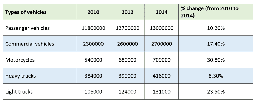
Task 1: The table gives information about five types of vehicles registered in Australia in 2010, 2012 and 2014
Sample:
The table details the volume of vehicles registered in Australia in 2010, 2012 and 2014. Overall, the number of vehicles in all the five categories enjoyed steady upward trends, with the figures for motorcycles and light trucks undergoing the most significant upswing. It is also clear that passenger vehicles are the most prevalent mode of transportation among the five types surveyed.
In 2010, 11,800,000 passenger vehicles were registered in Australia, far eclipsing the number of commercial vehicles (2,300,000), motorcycles (540,000), heavy trucks (384,000) and light trucks (106,000). Over the next 4 years, the number of the five kinds of vehicles all saw increases, with the volume of motorcycles and light trucks witnessing the most drastic changes of 30.8% (to 709,000) for the former and 23.5% (to 131,000) for the latter. The other categories also showed rises, albeit a little bit less pronounced, with the figures going up to a high of 13,000,000 (+10.2%) for passenger vehicles, 2,700,000 (+17.4%) for commercial vehicles, and 416,000 (+8.3%) for heavy trucks.
(167 words)
2.2. Tháng 2/2020
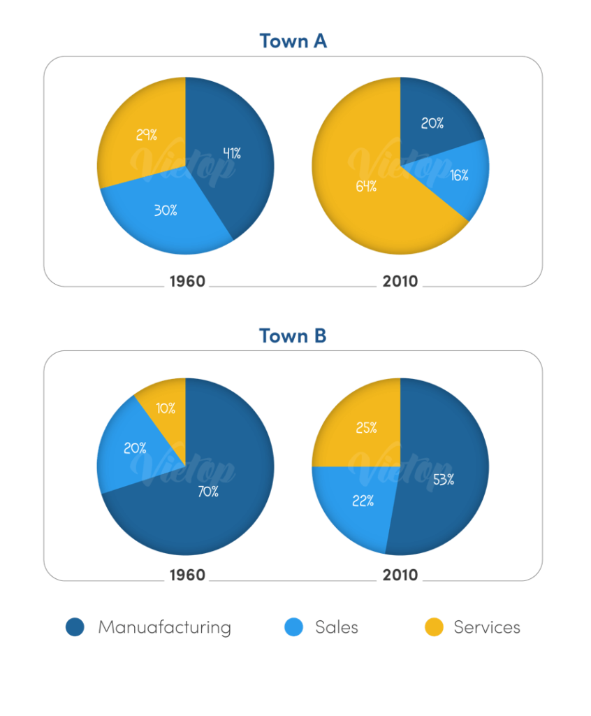
Task 1: The charts below show the percentage of people working in different sectors in town A and town B in 1960, 2010.
Sample:
The pie charts set out the proportion of people employed in three different sectors in the two unspecified Town A and Town B in 1960 and 2010. Overall, over the given period, manufacturing-related jobs were less popular in both towns, whereas the service sector showed an opposite pattern, and positions in sales underwent a downward trend in Town A but not Town B. It is also clear that by 2020, whilst the service sector outstripped manufacturing as the dominant job sector in Town A, manufacturing, despite undergoing a decrease, remained the most common in Town B.
In both towns, services experienced the most substantial rise, with its figure undergoing a more than twofold leap from 29% to 64% in Town A, and from 10% to 25% in Town B. Opposite patterns are evident in manufacturing as its percentage halved from 41% to 20% in Town A, and in Town B it also underwent a drop, albeit milder, to 53%, which still accounted for the majority of jobs.
In the meantime, sales-related jobs were reduced by half from 30% to 16% in Town A. It was not the case in Town B, however, when its figure rose marginally from 20% to 22%.
2.3. Tháng 3/2020
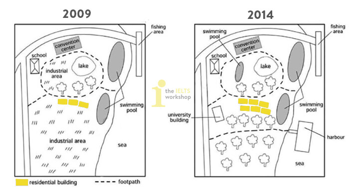
Task 1: The map below shows the changes that have taken place at the waterfront area of a town called Darwin between 2009 and 2014.
Sample:
The maps depict the development of a town named Darwin from 2009 to 2014. The initial impression from the maps is that the town showed the complete obliteration of the industrial area to make room for more residential, recreational and academic amenities. In addition, the town’s infrastructure was also renovated with the addition of a harbor and more footpaths.
In 2009, on the vast grassland stretching from the center to the southern part of the town was sited an industrial area. Over the next 5 years, this industrial zone became non-existent, and was replaced by trees. To the southeast of the town, a new harbor was erected, and an additional footpath was established, leading from the harbor to the main road in the west of the town. This new footpath further divided the southern zone of the town into two distinct areas, the upper part of which had some new residential buildings and a new university one.
Regarding the area encircled by the footpaths, the former industrial area was converted into a swimming pool. The school and the convention center located in the vicinity of this area and the northern main road remained unchanged. The two swimming pools by the beach also remained in the same position over the given period.
2.4. Tháng 4/2020
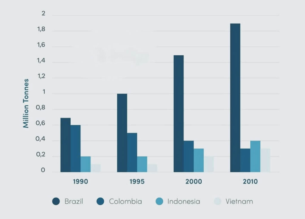
Task 1: The graph gives information about coffee production in 4 different countries from 1990 to 2010.
Sample
The bar graph details the volume of coffee produced in four nations over the 20-year course from 1990 to 2010. Overall, the graph tells us that Colombia aside, coffee production in all other countries enjoyed upswings, with Brazil experiencing the fastest growth. It is also clear that Brazil was always the number one coffee-producing country, and the discrepancy between this and the other countries became increasingly wider over the given period.
In 1990, around 0.7 million tonnes of coffee was produced in Brazil, and the figure rose sharply to 1 million tonnes in 1995, followed by an even steeper growth to 1.5 tonnes in 2000, and eventually peaked at 1.9 million tonnes – the highest of any country, in any year.
Coffee production in Indonesia and Vietnam, despite standing at much lower positions, followed similar patterns, with the former rising from 0.2 million tonnes in 1990 to 0.4 million tonnes in 2010 and the latter going up from an all-time low of only 0.1 million tonnes in 1990 to 0.3 million tonnes in 2010.
In the meantime, Columbia was the only country to undergo a downward trend in coffee yield. In 1990, it ranked second at 0.6 million tonnes, but later fell gradually and eventually it amounted to around 0.3 million tonnes in 2010.
2.5. Tháng 5/2020
Task 1: The maps show art gallery in Australia in 1950 and now. Summarise the information by selecting and reporting the main features, and make comparisons where relevant.
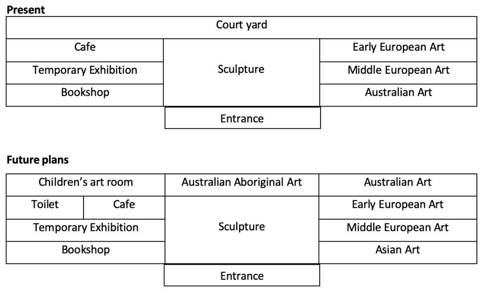
Sample:
The two maps show the site plans and layout of an Australian art gallery in 1950 and the present day.
Overall, the gallery is organized into a central area, an east wing and a west wing, each having about the same square footage. This basic configuration has not been changed, but the courtyard on the north side of the building in 1950 was incorporated into the gallery itself, creating two new gallery spaces in the central area and east wing as well as an art school for children in the west wing.
In detail, the west wing still contains the bookshop, café and temporary exhibition space that was in the older plan. However the café is reduced in size and a toilet added. The entrance, in the center of the south side of the building, leads to the largest area, reserved for sculptures. Behind it, the area which was formerly the courtyard has a new place for exhibiting Australian aboriginal art. There were significant changes made in the east wing. The space for Australian art was transferred to the former courtyard area and in its place Asian art is displayed. The two areas for European art have not been altered.
2.6. Tháng 6/2020
Task 1: The maps show the changes of an office building between the present and the future. Summarise the information by selecting and reporting the main features, and make comparisons where relevant.
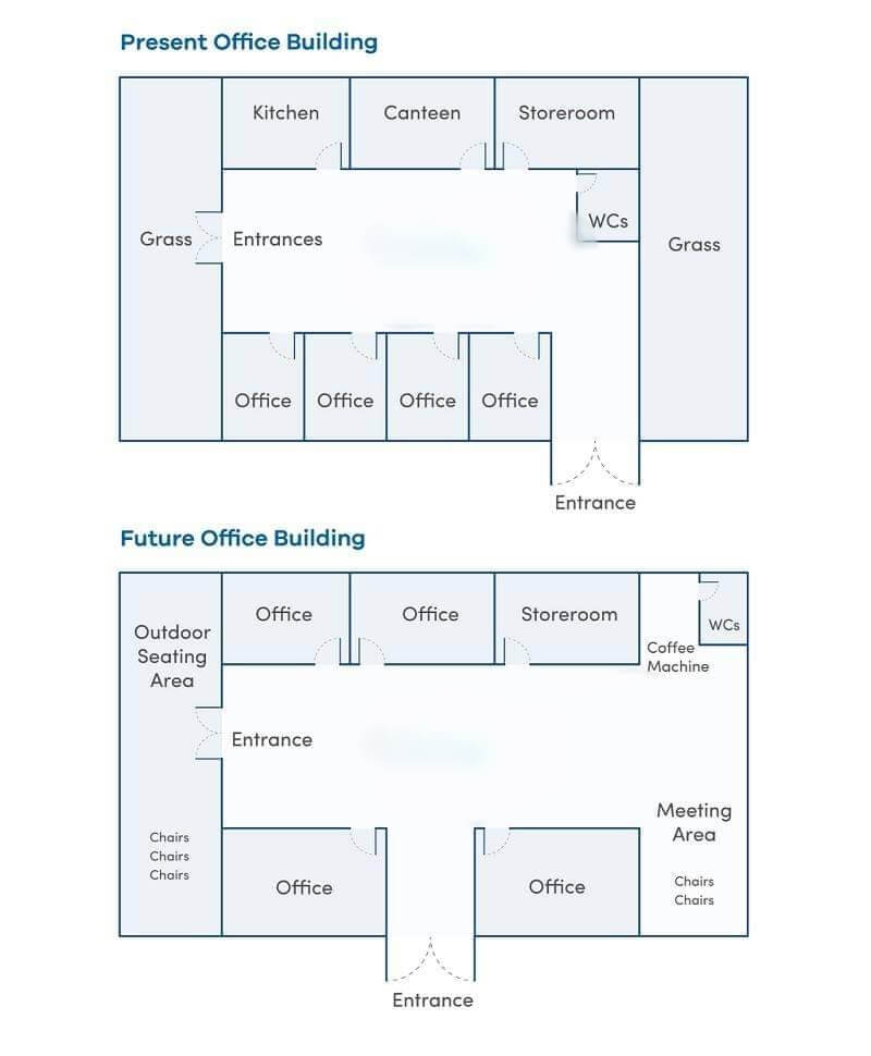
Sample:
The two maps illustrate the changes of a present office building in the future.
Overall, it is clear that the building is planned to be extended, with the new outdoor seating area and meeting area, along with a coffee machine. On the other hand, some rooms inside the building will be removed.
At the present time, there are two large grasslands on the left and right of the office. These lands in the future will be replaced by two new areas. The left one will be reconstructed to an outdoor seating place, with several chairs in the south. The right land will be rebuilt into an area for meeting purpose. A new coffee machine will be set in the north of the land, and beside it is the WCs, which is located in the east of the office in the present.
The west entrance of the building will remain the same, as well as the storeroom in the northeast side of the office. However, the kitchen and the canteen in the north will be made into the offices. There are four office rooms in the south and the entrance of their right. In the future, these will be combined into two big offices, with the entrance being moved to the center.
2.7. Tháng 7/2020
Task 1: The diagrams below show changes in Felixstone in the UK between 1967 and 2001. Summarize the information by selecting and reporting the main features and make comparisons where relevant.
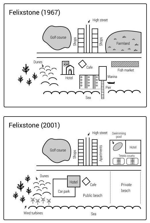
Sample:
The maps illustrate the changes to the changes have occured in Felixtone over a 30 year period beginning in 1967 and ending in 2001. The most noticable change is the replacement of green areas with several major infrastructure projects except a golf court and dunes.
To begin, there were several changes to the business sector in Felixstone. A block of apartments has been built just east of the High street opposite of the row of shops. In addition to this, a sports centre including double tennis courts and a swimming pool with a new hotel that stands ¼ part of the area. Wind turbines can be seen behind the dunes alongside the sea bed, and 2 artificial beaches, one private and one public, have been built together on the south side of the Main road passed by the middle of the town. However, the pier and the Marina have been totally removed from the town.
There have also been changes to transport, particularly to the right of the dunes, where large car park now stands in place of the hotel.
2.8. Tháng 08/2020
Task 1: The bar charts and line graph below show the results of a survey conducted over a three-year period to discover what people who live in London think of the city. Summarize the information by selecting and reporting the main features and make comparisons where relevant.
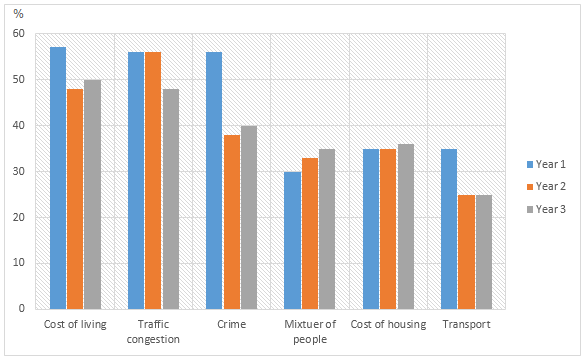
Sample:
The illustration expresses the opinion of Londoners across three years about the paramount and poorest aspects of living in London. Overall, shopping, job, night life and places to visit were picked as the greatest things about living in London while cost, traffic jam and crime were picked as the vilest thing there. Interestingly, cross-cultural people and transport were voted both as good and bad aspects about this city.
The highest percentage of Londoners, over 40%, believe that shopping experience in London is the best thing about living in this city. Around 35% of them picked employment facilities as the second most attractive aspects in London. Activities like night life, visiting places were mentioned by one-quarter of them as advantageous. On the contrary, half of them expressed their concerns about the cost of living. A similar presentence of the survey takers expressed traffic congestion as a hindrance for their living. Crime was another worst thing about London according to these survey participants.
Interestingly, cross-culture and transports were both mentioned as great and worst thing about life in London. Finally, majority of the citizens expressed their apprehensions about litter, noise and air quality to be major issues.
Xem thêm bài viết liên quan: Tải sách Academic Writing for IELTS by Sam McCarter miễn phí
2.9. Tháng 9/2020
Task 1: The diagram below shows the process of making carbonated drinks. Summarize the information by selecting and reporting the main features and make comparisons where relevant.
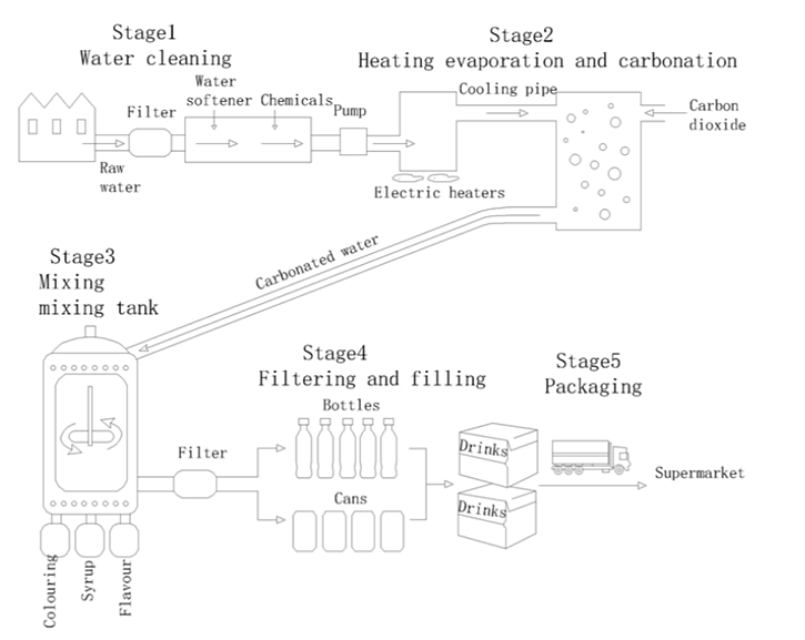
The diagram provides a breakdown of how carbonated drinks are produced. Overall, the production of carbonated drinks involves raw water undergoing five distinct stages at which the water is cleaned, carbonated, mixed with other ingredients, packaged and eventually delivered to the general public.
The process commences when raw water from households flows in pipes to a device where it is filtered and softened by the use of chemicals. The clean water is thereafter pumped to electric heaters and goes through a cooling pipe to another device where the carbonation process takes place. During this process, carbon dioxide from another pipe is added to the water.
The carbonated water is then sent to a cylindrical tank in which it is mixed with colouring, syrup, and flavours and filtered for the second time before being filled into bottles and cans. At this stage of the process, the finished beverages are packaged into boxes and eventually dispatched to
2.10. Tháng 10/2020
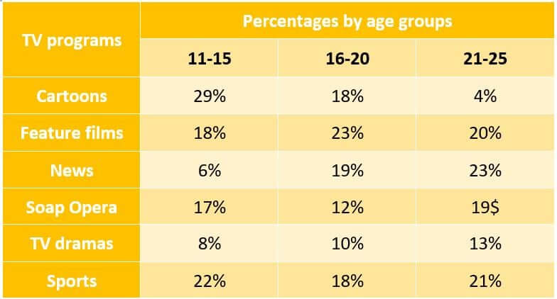
Task 1: The table below shows a survey on the preference of different age groups in a European country on different TV programmes in 2012. Summarize the information by selecting and reporting the main features and make comparisons where relevant.
Sample:
The provided table chart illustrates about a survey on various television programs which was seen by people of different age categories in European nation in 2012.
It can clearly be seen that according to survey of 2012, 29% individuals of 11-15 age group mostly liked to watch cartoons and 22% sports. There were 1% difference between feature films (18%) and soap opera (17%). Tv dramas were watched by 8% and 6% selected to watch news. Moreover, in the age group from 21 to 25 almost all television programmes were famous among the masses , except cartoons ( only by 4%).
Moving further towards remaining information , the popularity of feature films were more rather than tv dramas in age group of 16 to 30, 23% and 10% respectively. The same percentage of multitudes could be noticed who were saw cartoons and sports with 18%. News channels were being seen by 19% and it was most common as compare as soap opera which was preferred by only 12% .
Overall , it is clear that news programme became more popular with the advancement of age ,while the popularity of cartoons related shows decreased.
3. Lưu ý khi làm bài IELTS Writing Task 1
Dưới đây là một số lưu ý khi làm bài IELTS Writing Task 1 mà bạn học cần nhớ:
- Writing Task 1 đa số là dạng bài so sánh chứ không phải miêu tả nên tránh viết kể lể lan man và miêu tả biểu đồ qua nhiều trong bài làm.
- Tối ưu sự đa dạng trong cấu trúc và từ vựng Tiếng Anh sẽ là một cách hữu ích giúp bạn đạt điểm cao.
- Viết đủ từ, đủ ý, tránh dài dòng tốn thời gian.
- Bám sát câu hỏi đề ra để làm bài và viết đúng yêu cầu bài.
Trên đây là tổng hợp đề thi và bài mẫu IELTS Writing Task 2 mới nhất năm 2020, Tài liệu số hy vọng có thể giúp bạn học đạt được điểm cao trong kỳ thi qua bài viết trên. Và đừng quên theo dõi chuyên mục tài liệu để tham khảo những quyển sách bổ ích khác nhé! Chúc bạn thành công.